A huge part of creating a beer brand is crafting an individual identity that not only draws someone to that particular beer but also symbolizes what the company stands for and what makes them different from other brewers. The challenge with all things design is to create something unique, timeless, and purposeful. More often than not, logos and packaging seem little more than half-assed. But the best brewers create beer brands that seamlessly blend design with their individual passion.
I dug through hundreds of beer brands and chose the ones that stood out the most in terms of design. Then I broke my choices down into four categories—logo, label, packaging, and website—to give you a better idea of how intensely committed the best breweries are to creating beer brands that evoke those things they’re most passionate about.
Beer Brands - LOGO
The logo that really dominated this category belongs to Brooklyn Brewery. They have a bit of an unfair advantage since they were able to get Milton Glaser, designer of the famous I [heart] NY logo among many other famous works, to design their logo. The Brooklyn Brewery logo has an asymmetrical B surrounded by their name; it’s a fairly simple design, but it allows for so much versatility. But what really makes this beer brand’s logo so great is that it really embodies an old school, New York spirit and gives native New Yorkers something to identify with.
![]()
Beer Brands - LABEL
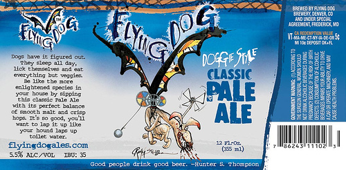
Flying Dog Brewery has the most beautiful labels and I will argue this until the day I die. The label art is all done by British cartoonist Ralph Steadman and the distinct, yet consistent, style from beer to beer makes it incredibly easy to identify this beer brand in even the largest bottle shop. On more than one occasion I’ve heard that the beautifully bizarre art is what got people to buy the beer in the first place. The labels have an identifying color, an absurd name, a back story that explains the beer’s origin, and a crazy-looking creature, giving each beer a unique personality to go along with its delicious flavors.
The runner up is No-Li Brewhouse from Spokane. With no actual label on the bottle, they’ve distinguished their bottles through screen printing. Unlike many other brands who use screen printing, No-Li uses a combination of white and a designated color for specific brews. By incorporating some fairly-detailed illustrations into the designs they add some iconic flair which makes these labels more kick-ass than the rest.

Beer Brands - PACKAGING
This was by far the most difficult to pick from since (surprisingly) so many beer brands go above and beyond the basic cardboard or paper based packaging. The absolute best comes from Mekfartin Homebrewery in Slovakia. Their Oaked Beer is single packed in a can that looks like an oak log. Their IPA, Georgy Porgy Lemon Grass, is in a green bottle with a label that you need to unwrap to show the beer information which allows for absolute simplicity. And that’s only two of their seven types. Mekfartin’s designs change with each new batch of beer to reflect each beer’s flavors and individuality, showing a real commitment to both their beer and the design of the packaging that holds it.

Beer Brands - WEBSITE
Last, but definitely not least, website design. Websites are extremely important for beer brands because, when they work well, they generate curiosity about and demand for the beer the brewer works so hard to create. Having a beautifully-designed web space with well-conceived content can have a huge impact.
That being said, it’s a bit of a tossup between Canal Park Brewing Company and Left Hand Brewing Company! Canal Park’s site keeps everything bright and sunny on their home page, is responsive to screen size changes, and has clean layouts. Left Hand lets things get a little more artsy, diverging from the style of their beer labels, but keeping with the overall feel of their brand. What impressed me the most with each of these beer brands was the information on their brews. Each gave a “normal option” and an option for us “beer geeks.” The beer geek sections provided super-valuable information, including appropriate glassware, availability, malts, hop varieties, original gravity, and IBUs.
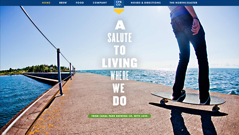

The small differences that kept them at a tie were that Canal Park offers suggestions for who certain beers might be good for in a nonconventional way. The Dawn Treader suggests it’s for people who like “long hikes, late nights, conversations with yourself” which means I may have just found my perfect beer. Meanwhile Left Hand has suggestions to “enhance the flavor” through food pairings. What’s especially great about Left Hand’s pairings is that, while not all beers have pairings, the ones that do offer many options per beer with suggested recipes for those options. Some recipes even feature the beer as an ingredient. Both sites have great attention to detail and a serious understanding of the interest of their beer drinkers.


Think I missed somebody? What are your favorite beautifully-designed beer brands?


